This illustration is the final project for a two-day exercise in which our professors acted as art directors commissioning us for a rush job illustration for their science newspaper. We had two days to complete the project and had to fit specific layout requirements such as font size and aspect ratio, as well as meet the needs of the client and their newspaper’s audience. This exercise also included contract and pricing methods.
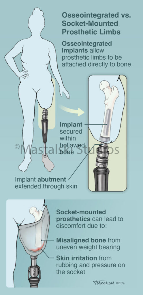
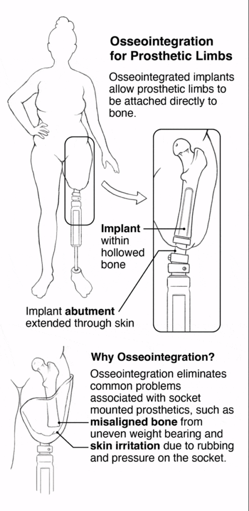
I was commissioned by my “art director”, David Rini, to create a generalized illustration of osseointegrated prosthetics for his newspaper audience. I decided it would be important to highlight not only what osseointegrated prosthetics are, but why they are used instead of the traditional socket-mounted prosthetics. Care was taken to create a word story that fit the level of instruction, as well as create generalized prosthetics that weren’t carbon copies of actual prosthetics but were still grounded with mechanical accuracy.
After my initial meeting with my client, I started thumbnailing. I experimented with both vertical and horizontal formats with the required dimensions. With the abbreviated time frame of the project, thumbnailing quickly went through two rounds of critique with the client before moving on to the final piece.
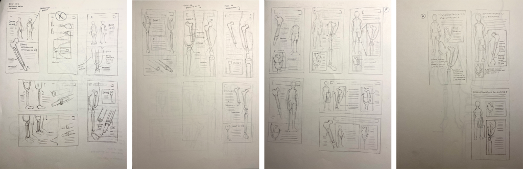
Once the thumbnail was approved, I quickly sketched a nicer version of the main illustrations to use as a template for my transfer sketches.
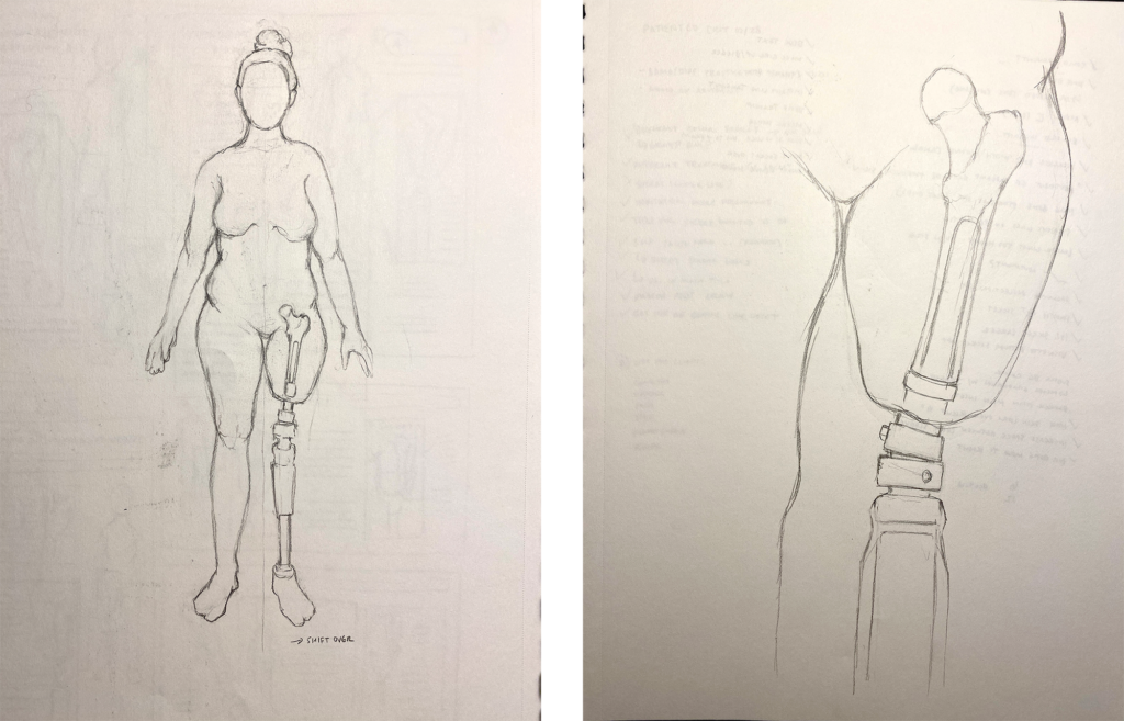
I scanned my transfer sketches and played with the layout in Photoshop. By the end of the first day, I had my final linework and layout turned in to my client.
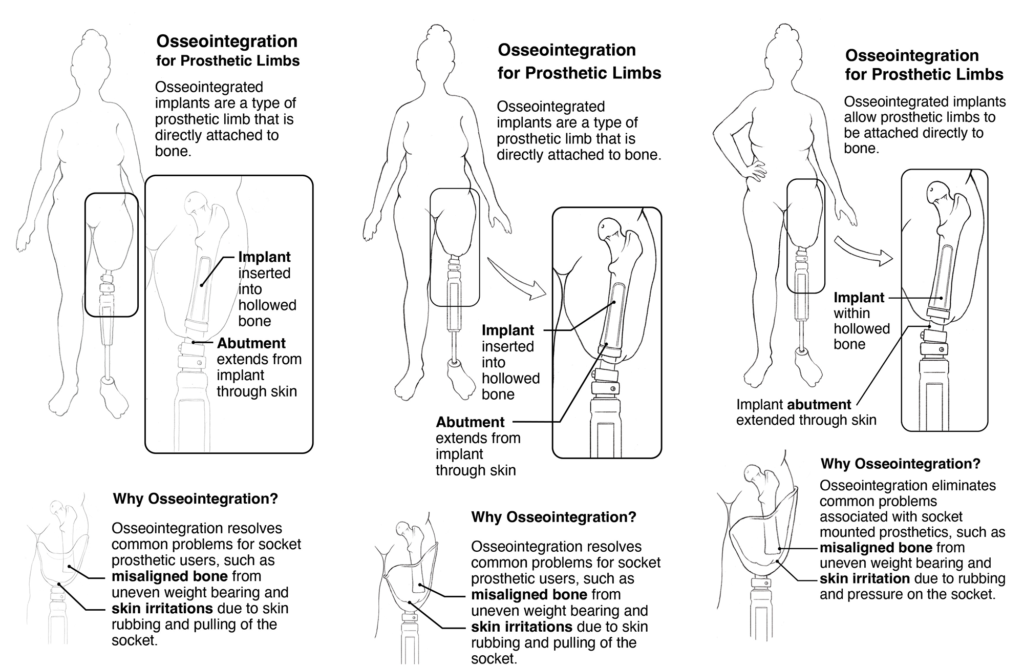
The next day, after receiving minor edits from my client, I got to work on rendering. He wanted mostly flat colors: more graphic than realistic. I chose cooler tones for the figure and fit the rest of my colors accordingly. Everything is flat except for some shine on the metal prosthetics and a bit of transparency on several details. Adjustments were made following a few meetings with the client and a final critique.
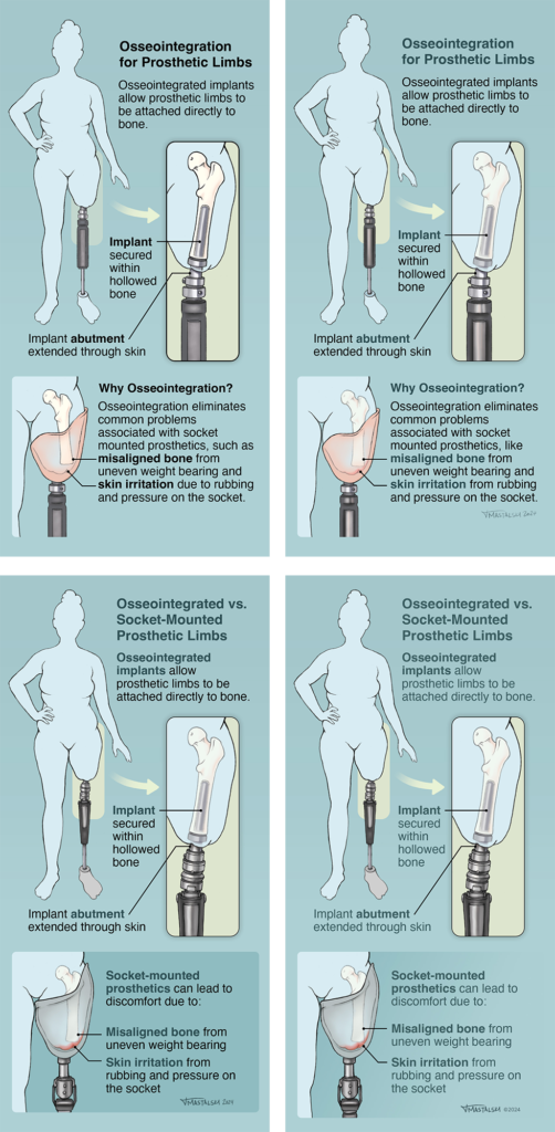
This is the final piece: