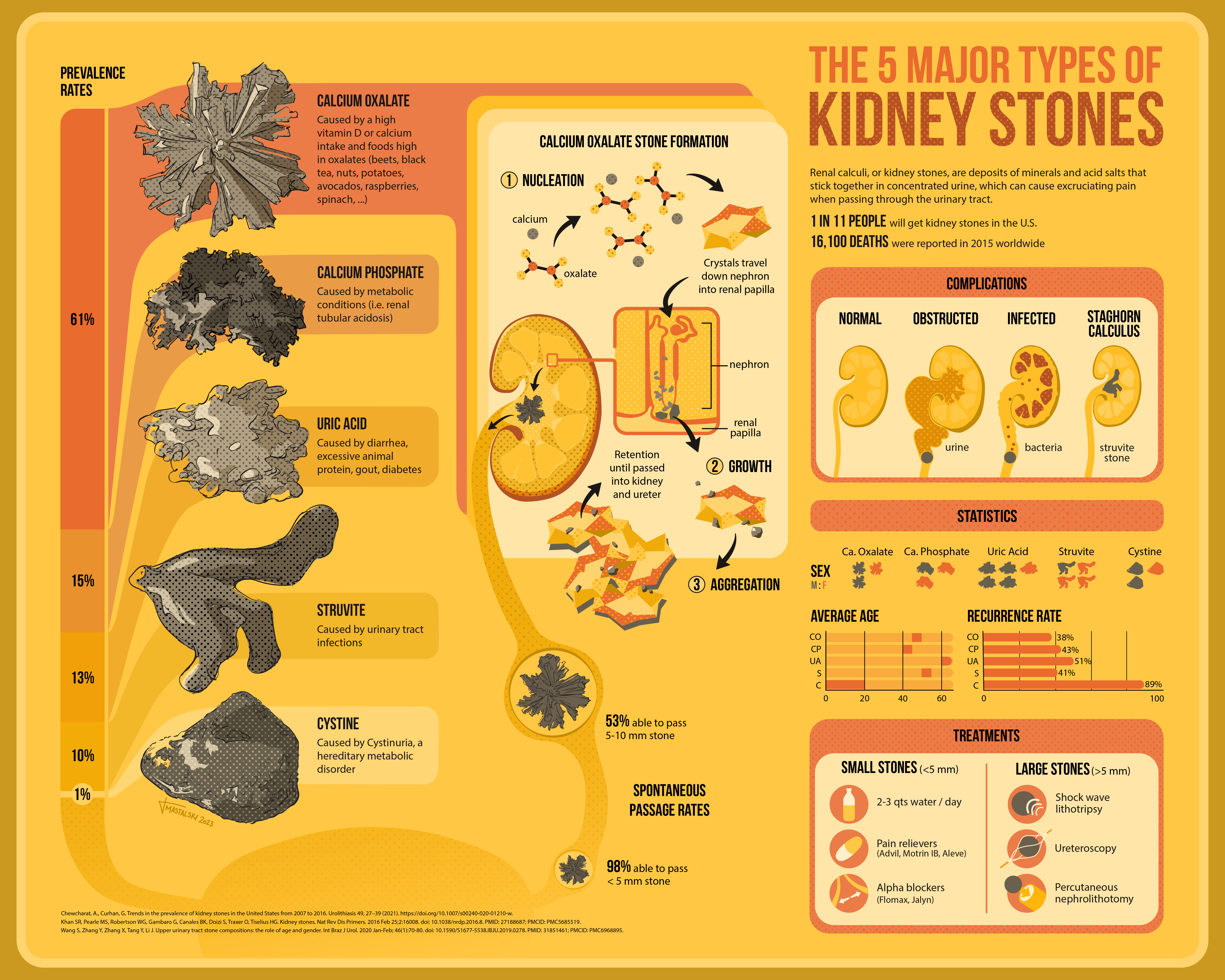
The focus of this project was on data visualization and coming up with clever solutions on how to interestingly present a lot of important statistics and facts. I chose to compare the five major types of kidney stones, showing how kidney stones are formed and presenting information on each of the types. This was my first foray into data visualization and this level of graphic design, and I had a great time coming up with how to display a lot of dry numbers in a way that was inviting and unique. Check it out below.
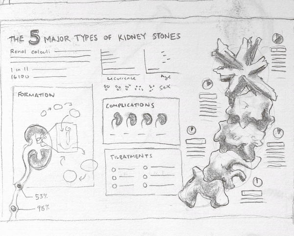
Excerpts of initial theme ideation. It took several rounds of thumbnails to really hone in on a strong, central idea for the piece.
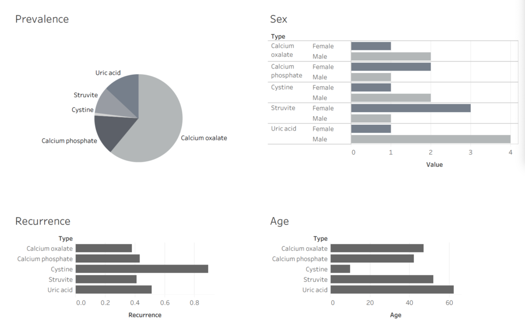
I used Tableau to compile important data found throughout my research
I then created a moodboard (not picured) to focus my design on a particular theme–a retro, halftone-y vibe with a limited color palette. I think I stuck to that pretty well!
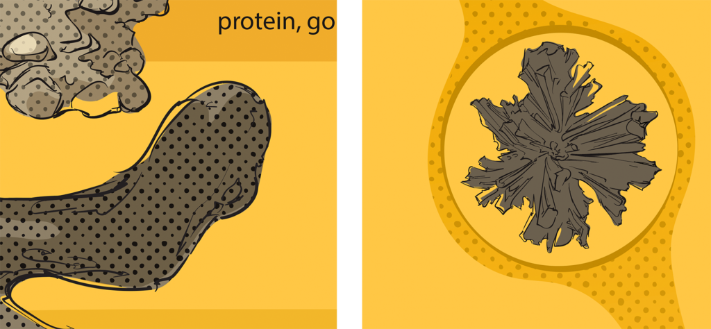
I eventually got my layout pretty much sorted out and made a few nice sketches in a bit more detail. I also started to map out how I wanted my central stone formation graphic to look.
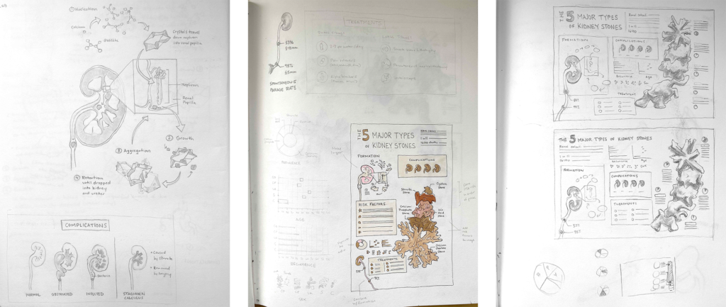
Then came rendering in Illustrator. There was a bit of a learning curve involved in using the program, but once I got a hang of it, I had a lot of fun playing with textures, line weights, etc.
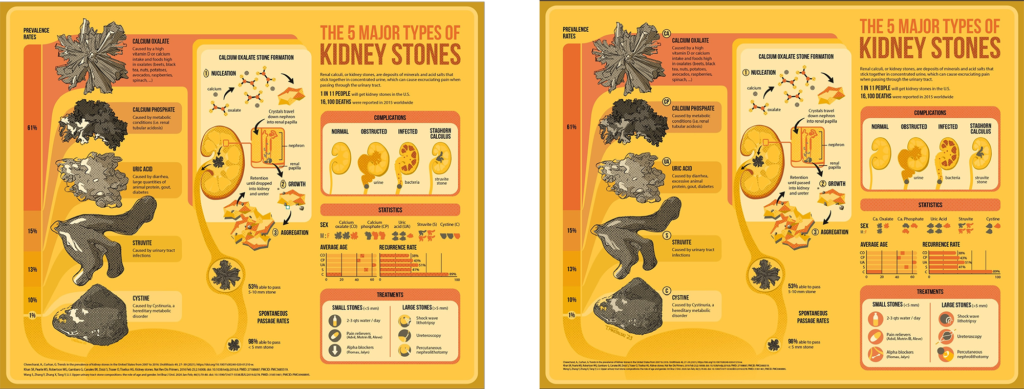
And the finished piece: